Quantcast
Channel: Mari Belajar - Belajar dimana saja dan kapan saja.
Viewing all 412 articles
Browse latest View live

How to Use New Blogger HTML Editor

$
0
0
The Blogger template editor now includes a number of changes that seem interesting and make it much more friendly than it was.

To begin with, what we see now is all the template's code starting with numbered and colored lines showing us different code snippets: tags, variables, properties, etc.. depending on the HTML, CSS, JavaScript and even the language of Blogger - includeb:if and other occurrences.

blogger template, blogger tricks, blogger widgets

This is what any decent external editor does, but certainly, from now on it will be much easier to find that little bug that drives us crazy when we omit quotation marks or add one more semicolon. This also applies to CSS, which appears mostly in dark blue without distinguishing selectors and rules, but the rest is a major improvement. 

Another great help are the numbers that appear in front of each fragment of code, so that we can easily pinpoint and correct errors of this type: "Error parsing XML, line 103, column 9: The element ... "

Using the New Blogger Template HTML Editor


When you want to search for a code in the HTML editor, click inside the editor and press CTRL + F on your keyboard, then enter what you want to find in the search box that appears inside the editor.

Finally, hit the "ENTER" button on your keyboard and it should take you to the requested code.

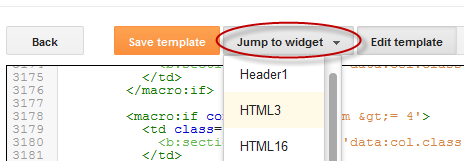
If you want to be taken to the section of code that belongs to a particular widget, just click on the Jump To Widget button at the top of the editor, choose the widget's name from the list and it will take you directly to that portion of code. 

The CSS rules can be found folded at the top of the template, between <b:skin>...</b:skin> and <b:template-skin>...</b:template-skin> tags. To expand them, you have to click on the sideways arrow next to the line number.

Another great functionality is that now we can Preview Template in the same window without needing to leave the page and we can easily go back to customize our template by clicking on the Edit Template button.

Finally, Format template re-orders the code, adding indentation automatically.

As always, we must use the Save button for the changes to take effect or we can Revert the changes.

And that's it. With a bit of effort, we can easily familiarize with this new HTML editor. Surely as usual and even reasonable to be something inherent in the human condition, this change does not appeal to many. Same with the Lightbox for images, the new template designer, the new desktop and other new things that have been added in the past. But who now remembers that they once were new?
----------
For more info, check out this post on the Blogger Buzz blog, where Google software engineers +Samantha Schaffer and +Renee Kwang explained the steps for moving the date of a blog post from above the post title to underneath it, as an example in using the new Blogspot HTML editor.

10 Strategic Places To Put Adsense Ads In Blogger

$
0
0
This article will discuss about the more common 10 places on our blog where we can place ads and about how to implement them and also which are the most suitable formats based on those available in our AdSense account.

Advertisements

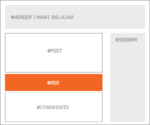
In the Sidebar

adsense, ads, add adsense blogger

How to implement.

This is one of the easiest places to place AdSense. Just go to the page elements (layout), click on the "Add a Gadget" link and add an HTML/Javascript widget with your ad code inside it or add directly an AdSense widget.

Recommended formats: 125 × 125, 120 × 600 and 160 × 600

Between posts

blogger posts, blogger tricks, adsense ads

Implementation. You can implement AdSense ads between your posts: go to Layout, click on the "Edit" link below the Blog Posts section, then check the "Show Ads Between Posts" option.

Recommended formats: 468 × 60, 300 × 250 and 336 × 280

Under the header

blogger header, blogger tips, adsense

Implementation:

Firstly, convert your AdSense ad code. You can use this converter here:
AdSense Ad Converter

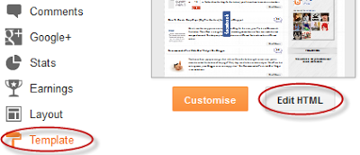
Then, go to your Blogger Template (from your Dashboard, click on Template and press the Edit HTML button) and search for:


Note: if you can't find it, search it without the ending slash /

Paste the converted code right after it.

Recommended formats: 468 × 68 and 468 × 15

Under the post title (visible only on the posts pages)

Implementation:

Convert your ad code and then go to your Template, Expand Widget Templates and look for:


Note: if you can't find it, search it without the trailing slash /

Paste the converted code, following this example:


Recommended formats: 468x68 and 468x15

In the posts' footer 


post footer, adsense, blogger blogspot

Implementation:

Convert your ad code and then go to your Template, Expand Widget Templates and look for:


Note: if you can't find it, search it without the trailing slash /

Paste the converted code right after this line.

Recommended formats: 468x68 and 468x15

In the post's body (it will be visible on all pages)

adsense how to, blogger tricks, gadgets

Implementation:

Convert your ad code and then go to your Template, Expand Widget Templates and look for:


Recommended formats: 125x125, 180x150, 120x240 and 200x200

In the post's body (visible only in post pages)

Convert your ad code and then go to your Template, Expand Widget Templates and look for:

Test 7

Note: in case you don't fint this code, search only for <div class='post-body'>  

And paste the converted code, following this example:


Paste the converted code just above it, following this example:


Recommended formats: 468x60, 300x250 and 336x280

In the blog's footer

blogger footer, adsense ads, make money online

Implementation:

Convert your ad code and then go to your Template, Expand Widget Templates and look for:


Paste the converted code right after it.

Recommended formats: 728x90 and 728x15

FAQ

I anticipated some questions likely to arise:

I can't find the codes, what should I do?
Always check the "Expand Widget Templates" checkbox. These are the default codes of Blogger and should be found in all the templates unless they have been changed by a hack or the template designer.

Why should I convert my AdSense code?
The Blogger's Template reads it as text and not as code and it is good to avoid any errors when trying to save it.

The ads are not displaying properly, why is that?
The ads could be affected by the styles (CSS) selectors (divs) containing them and some templates could be wrong designed, then you should consider modifying these styles, look for another relevant place or in extreme cases, change the template.

Can I put the all 10 codes on my blog?
No, you should choose just one of the places where you want to put the ads considering that AdSense have some limits on the number of ads that could be displayed. Try to make a balance with your content.

Why we there should be only 3 ads displayed on the main page?
Is due to the limit set by the AdSense. Combine the type of ads (text, rich media ads and link units) to be able to show the number of ads you want.

Hopefully, this will be useful to those of you wanting to display AdSense ads on your blog.

How To Hide Blogger Sidebar To Display AdSense For Search Results

Next: How To Add a Tabbed Navigation Widget for Blogger
Previous: 10 Strategic Places To Put Adsense Ads In Blogger
$
0
0
When visitors are searching for content on your blog, you have the following options to display the search results: opening the results in the same window, in a new window or within your own site using an iframe.

But the best option is to display the search results in your own site/blog, mainly because you are not sending people off your blog and when they are taken to a new page of search results, so it could be confusing many times because it doesn't look anything like your site or Google. Therefore, displaying the search results within your site, could look more professional and could also increases your page views and your revenue from the ads on the search page.

A problem that many bloggers are facing is that the page which displays the AdSense for search results must be at least of 800 px wide, so the posting area must be of minimum 800px and there's nothing like that in most of the blogs. 

So, what we will do in this tutorial is to set up the search results to be displayed in a static page (none of other posts or pages will be affected) where we'll remove the sidebar, so that we'll have enough space to make the post/page section of 800px wide. Also, we will create a static page specially designed for the search results, then create a new AdSense for search in our AdSense account and finally add a small snippet of code top in your Blogger template to hide the sidebar in that specific page.

Search results span the width of the page with the sidebar hidden:


Display AdSense For Search Results Within Blogger Page

Step 1. Create a new static page on your blog, you can give it the title 'Search Results' but leave the content section empty and then Publish the page.

Step 2. When you publish the page you have the option to add the page to a menu, choose the third option 'No Gadget Link To Pages Manually' click 'Save and Publish'. OR in case this screen will not appear, right click onView Page and select Copy Link Address. We will need this URL of the page when creating the AdSense for search.

Step 3. Go To Your AdSense account, then go to My ads tab, select the Search option and Create a New custom search engine. Follow the steps until you come to the Search results option.

Step 4. Select the 3rd method "on my website using an iframe", then Enter the URL of the page you created into the URL field and continue.


Step 5. Follow the rest of the set up process, at the end you will be given two pieces of code. The first piece of code is for the actual search bar that you can paste into a Html/Javascript gadget in your sidebar or wherever you want it. The second piece of code you must copy and paste into a new HTML/JavaScript gadget and after clicked on Save - drag it above the Blog Posts area 

 Now that you have your page set up with the search results code and your search bar code in your sidebar, it is time to add a snippet of code to your template to remove the sidebar.

Adding The Code In Blogger To Change the Results Page Layout

Step 1. In Your Blogger Dashboard, go to Template > Edit HTML - then click Proceed 


Step 2. Select the "Expand widget templates" box


Step 3. Find (CTRL + F) the following piece of code


Step 4. Just below it, paste this code:


Note: Replace PAGE-URL-HERE with the url address of the page where the search results will be displayed (the one you have added at the step 4)

Step 5. Now Save Template and you're done!

This simple trick allows you not only to hide the sidebar in the search results page, you can, as well, hide it in any page you want... just create your page and follow the same steps. It is also good to hide the sidebar in Privacy Policy Pages, Contact Pages and in all the non-content-based pages with little content or no content at all.

Make sure to check out other interesting AdSense Tutorials.
If you need more help, leave your comments below.

How To Add a Tabbed Navigation Widget for Blogger

Next: Scrolling Recent Comments Widget For Blogger
Previous: How To Hide Blogger Sidebar To Display AdSense For Search Results
$
0
0
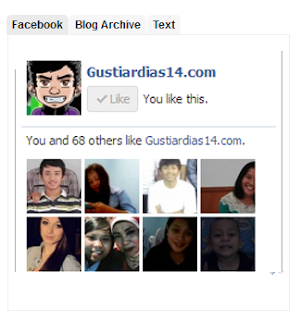
The tabviews are elements that allow us to group in a single container various gadgets and these can be selected via tabs.
Its main function is to save space on the blog to avoid scattered gadgets in the same category so you can group multiple gadgets into one. There are several methods for creating tabviews, some require jQuery, other MooTools, or any other script.

To add this widget to your blog, just follow the steps below:

Step 1. From your Blogger Dashboard, go to Template and click on the Edit HTML button

Step 2. Expand the style of the template, by clicking on the sideways arrow before <b:skin> ... </b:skin>


Step 3. Search using CTRL + F for the following tag:


Step 4. Just above it, add the following code:


Step 5. Find the </head> tag and just above it, paste this script:


Step 6. Finally, look for this line:


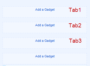
Step 8. Save changes, and go to Layout and there you will see the new areas to add gadgets.


You just have to click on Add a Gadget to add the gadget to the tab that corresponds, or drag a gadget you already have to that section.

If you want to add more tabs, then just add before the last </div> a line like this:


Note that each line you add should have a different ID, for example Tab5Tab6, etc..

You can add multiple tabs, just repeat the last step and likewise remember to change the name of the IDs.

Remember that if your sidebar is too narrow, then you should not put a lot of tabs, or tab titles that are very long.

You should also note that this gadget does not speed up the loading speed of the blog, is only to group gadgets into one, even, depending on the blog-may take a while to load the tabview.

Scrolling Recent Comments Widget For Blogger

Next: Cara Membuat Page Navigation Number di Blogspot
Previous: How To Add a Tabbed Navigation Widget for Blogger
$
0
0
This Expandable Recent Comments is a very accessible widget that can be collapsed or expanded through user interaction, so that now, we don't have to click on the commenter or post title link in order to see the content of a comment.
recent comments widget, blogger gadgets, blogspot tricks

The expanding content can be shown or hidden by clicking on the plus/minus icon or by pressing the "Show all" or "Hide all" button at run time. 

How To Add The Expandable Recent Comments Widget to Blogger

Step 1. Log in to your Blogger dashboard and go to Layout > Click on "Add a Gadget" link


Step 2. From the pop-up window, scroll down and click on the HTML/JavaScript widget


Step 3. Copy and paste this code inside the empty box:


Note: Replace http://yoururl.blogspot.com with your blog/site address.

Step 4. Save your widget and you're done!

Enjoy :)

Cara Membuat Page Navigation Number di Blogspot

Next: Materi dan Soal UTS Interpersonal Skill Bu Linda Islami
Previous: Scrolling Recent Comments Widget For Blogger
$
0
0
Cara Membuat Page Navigation Number di Blogspot Cara Membuat Page Navigation Number di BlogspotSudah pernah melihat kan beberapa template yang menggunakan page navigation number pada templatenya. fungsi dari page navigation number ini adalah untuk menggantikan link posting lama atau posting baru yang ada pada bawah postingan halaman utama pada sebuah template. Dengan page navigation number ini pengunjung bisa bebas memilih halaman postingan keberapa yang ingin dibaca.
Tutorial Blog lengkap, b-digg

Page navigation number ini juga bisa dibilang memberikan kesan rapi dan indah pada blog kita, walaupun saya sendiri tidak menggunakannya. Tetapi jika ada sobat yang ingin menggunakan page navigation pada blognya, berikut ini saya berikan Cara Membuat Page Navigation Number di Blog.

1.Log in ke blogger.
2.Klik template » edit HTML » centang Expand Template Widget.
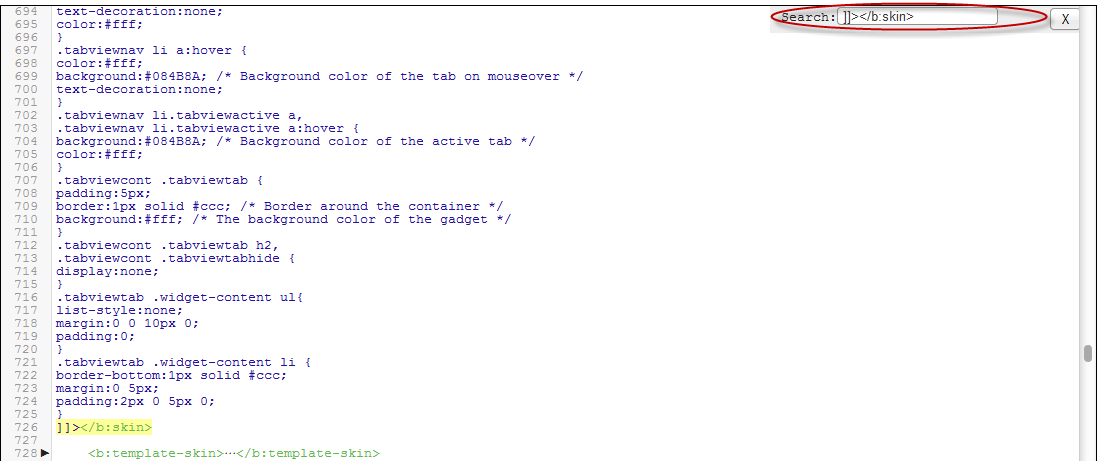
3.Cari kode ]]></b:skin> dan letakkan kode dibawah ini tepat di atasnya.


4.Cari kode </body> dan letakkan kode dibawah ini tepat di atasnya.


Keterangan:

  • Jika anda ingin mengganti jumlah postingan yang akan ditampilkan pada setiap halaman silahkan ganti kode yang berwarna biru.
5.Cari kode 'data:label.url' dan ganti kode itu dengan kode dibawah ini.


Keterangan:

var pageCount=4; (Jumlah postingan yang akan ditampilkan)
var displayPageNum=4; (Jumlah tombol angka navigasi)


6.Save Template anda.

Nah selesai sudah Cara Membuat Page Navigation Number di Blog mudah-mudahan artikel ini bisa bermanfaat bagi anda

Terima Kasih Anda Sudah Membaca Artikel Tentang Cara Membuat Page Navigation Number di Blog


Sumber : http://jembersantri.blogspot.com

Materi dan Soal UTS Interpersonal Skill Bu Linda Islami

Next: Cheat Point Blank dan Dragon Nest INA Terbaru
Previous: Cara Membuat Page Navigation Number di Blogspot
$
0
0

Linda Islami Dosen dan PR Manager Universitas Budi Luhur. Sebagian Dari Materi Ibu Linda Islami tidak berbasis teori, namun interaksi langsung dari mahasiswa mahasiwa, artinya mahasiswa lebih banyak diberikan share dan mendapatkan ilmu dari interaksi tersebut.
Ternyata bu Linda hanya memiliki akun facebook fans page, keren juga sudah memiliki sekitar 1800 orang, Ini kalo mau gabung Public Speaking with Linda Islami ga tau deh yang asli namanya apa kalo facebook aslinya atau mau ke twitternya Linda Islami


Soal UTS dari Bu Linda Islami seperti ini

1. Menurut Kurt Singer Manusia Mempunyai 3 Kecakapan dasar (basic skill) seperti ketrampilan negosisasi, ketrampilan mengelola konflik, ketrampilan pluralisme. Bagaimana cara anda untuk meningkatkan kecakapan dasar tersebut ? Jelaskan !

2. Komunikasi Antar Manusia dapat dilakukan secara non verbal. Jelaskan menurut anda kelebihan dan kekurangan dari komunikasi non verbal tersebut ? Jelaskan !

3. Jelaskan teori komunikasi dari Schram, Duncan dan De Vito ? Apakah menurut anda teori teori tersebut bisa efektif dalam kehidupan bermasyarakat ? Jelaskan !

4. Jelaskan bentuk bentuk Interaksi sosial yang dapat mengakrabkan hubungan antar manusia (Assosiatif) dan yang dapat merenggangkan hubungan manusia (Desosiatif) kaitkan dengan Human Relation. Jelaskan !

5. Dalam berorganisasi kita sering kali mengalami Disosiasi (gangguan) yang dapat menimbulkan konflik. bagaimana cara anda mengasah kecakapan mengelola konflik sehingga hubungan dapat berjalan harmonis. Jelaskan !


Jika mau download  materi Bu Linda ada disini - Download

Cheat Point Blank dan Dragon Nest INA Terbaru

Next: Membuat Menu Drop Down Animasi CSS3 di Blog
Previous: Materi dan Soal UTS Interpersonal Skill Bu Linda Islami
$
0
0


Mau cheat Point Blank dan Dragon Nest work 100%? Cari aja sendiri ya :). Soalnya saya bermain game tidak menggunakan cheat, so maaf kalian tidak bisa menemukan cheat di blog saya ini :D

Ayolah kawan kita bermain dengan bersih tanpa cheat. Okay!


Membuat Menu Drop Down Animasi CSS3 di Blog

Next: Membuat Menu Navigasi Bergerak Jika di Turunkan Pada Blog
Previous: Cheat Point Blank dan Dragon Nest INA Terbaru
$
0
0

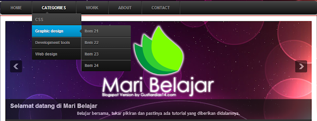
Membuat menu drop down animasi css3 di blog


Membuat Menu Drop Down Animasi CSS3 di Blog - Banyak cara dalam mempercantik sebuah blog, dengan memilih template blog yang sesuai, memasang widget blog, memodifikasi CSS blog dan salah satunya yang akan saya bahas kali ini adalah menu drop down untuk blog. Di dunia internet sudah banyak yang membahas tentang menu drop down. Bahkan banyak macamnya, mulai yang sederhana sampai yang elegant.

Sebenarnya menu drop down yang akan saya bahas kali ini bukan buatan saya sendiri. Maklum saya bukan blogger profesional, saya di sini baru belajar bisa di katakan blogger pemula. Oke lanjut saja, Menu drop down ini menggunakan CSS3. Tutorial ini saya dapat dari www.mybloggerlab.com. Jika mau lihat demonya bisa kunjungi blog ini.

Langsung saja Tutorial Cara Membuat Menu Drop Down Animasi CSS3:
1. Masuk ke blogger.com
2. Pilih Layout >> add gadget atau Tambah gadget (terserah dimana kamu ingin meletakkan menunya)
3. Kemudian pilih HTML/JavaScript
4. Copy sccript di bawah ini dan pastekan di kotak HTML/JavaScript yang kamu pilih tadi

'); $("#mbl-menu-trigger").on("click", function(){ $("#menu").slideToggle(); }); // iPad var isiPad = navigator.userAgent.match(/iPad/i) != null; if (isiPad) $('#mbl-menu ul').addClass('no-transition'); });

 Pengaturan:
  • Ganti tulisan URL-Here dengan url yang kamu inginkan
  • Tulisan yang berwarna Biru ganti dengan nama sesuai label atau url yang di tuju
5. Jika sudah selesai klik save atau simpan

Tutorial Menu drop drown diatas sangat simple, karena kamu tidak perlu melakukan edit HTML dan mengeditnya pun juga mudah tidak usah repot-reepot lagi melakukan dari edit HTML. Sekian dulu tutorial membuat Membuat Menu Drop Down Animasi CSS3 di Blog, semoga tutorial ini dapat bermanfaat untuk sobat blogger semuanya. Terima kasih

Membuat Menu Navigasi Bergerak Jika di Turunkan Pada Blog

Next: Menambahkan Emoticon Pada Komentar Blogspot
Previous: Membuat Menu Drop Down Animasi CSS3 di Blog
$
0
0
Membuat Menu Navigasi Bergerak Jika di Turunkan Pada Blog - Pada kali ini saya akan memberikan tutorial Membuat Menu Navigasi Bergerak Jika di Turunkan Pada Blog. Kurang lebih contohnya seperti pada gambar dibawah ini:

Oke Langsung saja tidak usah berlama-lama haha :D
Langkah pertama adalah seperti biasa masuk ke dasbord blog kalian.
Kemudian cari kode ]]></b:skin>
Langkah berikutnya adalah copy paste code CSS di bawah ini diatas kode ]]></b:skin> tadi :
Nah jika sudah melakukan langkah diatas, sekarang coba cari kode </head>.
Dan jika sudah ketemu kodenya, silakan copy paste script berikut, dan letakkan dibawah kode</head> tadi :
Jangan lupa simpan utak-atik template kalian dan sekarang menu diatas header yang bisa bergerak naik turun sudah jadi deh, tinggal menyesuaikan dengan template kalian, diantaranya :
  • Angka 970px silakan ganti sesuaikan dengan lebar body template sobat.
  • Ubah warna menu navigasi dan font sesuai selera.
  • Tanda #, isi dengan URL menu yang sobat inginkan dan silakan sesauikan nama menunya dan juga sobat bisa menambahkan dengan yang lainnya.
Demikian tutorial ringan mengenai bagaimana membuat menu navigasi diatas header yang bisa bergerak. Semoga manfaat bagi yang memerlukan.

Menambahkan Emoticon Pada Komentar Blogspot

Next: Membuat Kotak Script Tukar Link Pada Web
Previous: Membuat Menu Navigasi Bergerak Jika di Turunkan Pada Blog
$
0
0
Menambahkan Emoticon Pada Komentar Blogspot - Hay sobat blogger, apa kabar? Semoga sehat-sehat saja ya :). Oke pada kali ini saya akan memberikan tutorial kecil Bagaimana Menambahkan Emoticon Pada Komentar Blogspot kalian. Kurang lebih seperti ini:
Menambahkan Emoticon Pada Komentar Blogspot

Nah bagaimana cara membuatnya? Ayo ikuti langkah-langkah berikut :D

1. Kalian login ke Blogger.com.
2. Pilih menu Template dan kemudian pilih Edit HTML.
3. Cari kode </body>, Untuk mempermudah gunakan CTRL+F kemudian cari </body>.
4. Copy kode dibawah ini tepat diatas kode </body>.

5. Kemudian cari kode ]]></b:skin>, Gunakan CTRL+F untuk mempermudah pencarian.
6. Copy kode dibawah ini tepat di atas ]]></b:skin>.

7. Kemudian simpan template dan lihat hasilnya.

Walaa, mudah bukan? :) 
Jika emoticon turun kebawah buka link ini.

Membuat Kotak Script Tukar Link Pada Web

Next: Menghilangkan Subscribe to: Posts (Atom) Pada Blogger
Previous: Menambahkan Emoticon Pada Komentar Blogspot
$
0
0
Membuat Kotak Script Tukar Link Pada Web - Pasti kalian pernah menemukan kotak-kotak kecil yang berisikan kode untuk menaruh banner atau link blogger seseorang bukan? Contohnya seperti ini:
Membuat Kotak Script Tukar Link Pada Web
Nah kira-kira seperti itu contohnya. bagaimana cara membuatnya? lihat script dibawah ini,
Jangan lupa hapus karakter "*". Tulisan link teks bla bla.. bisa diganti dengan apapun sesuai keinginan kalian. Rows dan Cols juga bisa diganti sesuka hati kalian.

Oke dan begitulah Membuat Kotak Script Tukar Link Pada Web, mudah bukan? :D

Menghilangkan Subscribe to: Posts (Atom) Pada Blogger

Next: How To Add Go To Top And Go To Bottom Buttons In Blogger
Previous: Membuat Kotak Script Tukar Link Pada Web
$
0
0
Menghilangkan Subscribe to: Posts (Atom) Pada Blogger - Hay sobat, pada kali ini saya akan memberikan tutorial Cara Menghilangkan Subscribe to: Posts (Atom) Pada Blogger. Kenapa sih menu tersebut selalu ingin dihilangkan dari blog kita? Pasti jawabannya mengganggu pandangan pada blog kita bukan? hehe. Dan alasan spesifik mungkin kalian lebih menyukai Feedburner.com untuk mensubscribe artikel atau postingan.
Menghilangkan Subscribe to: Posts (Atom) Pada Blogger
Contoh Subscribe yang belum dihilangkan.
Iya langsung saja ya, ikuti langkah berikut ini:
1. Login ke Blogger.com
2. Pilih menu Template kemudian pilih Edit HTML.
3. Cari kode dibawah ini,

4. Hapus semua kode diatas, kemudian simpan template kalian.

Jika tidak ingin dihapus berikan script <!-- script -->, Contohnya seperti ini:

Mudah bukan? Silahkan coba di blog kalian. :)

How To Add Go To Top And Go To Bottom Buttons In Blogger

Next: Membuat share button menggunakan sharethis.com [Video]
Previous: Menghilangkan Subscribe to: Posts (Atom) Pada Blogger
$
0
0
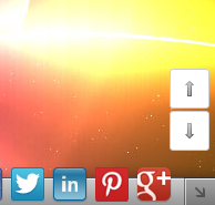
The Up and Down buttons can be used to navigate to the top and bottom of the page content, especially when on the main page there are many articles or when an article has too many comments. These buttons have a fadeIn and fadeOut effect, this means that they will fade slightly when we are scrolling to the top or bottom of the page and additionally, have the function of going up/down the blog.

How to put Go Up and Go Down buttons using the jQuery slide effect

Step 1. Go to Template, click on the Edit HTML button


Step 2. Search (using CTRL + F) for the following piece of code:

Step 3. Just above this code, paste this one:

Step 4. Now search (CTRL + F) for this tag:

Membuat share button menggunakan sharethis.com [Video]

Next: Cara Mudah Mengganti Scroll Bar Keren Pada Blog
Previous: How To Add Go To Top And Go To Bottom Buttons In Blogger
$
0
0
Membuat share button menggunakan sharethis.com [Video] - Malam sobat, sebenarnya saya itu lagi suntuk karena pacar lagi sakit, doakan cepat sembuh ya hehe jadi curhat sedikit :D. Pada malam ini saya mau berbagi tutorial Bagaimana Membuat share button menggunakan sharethis.com seperti yang saya gunakan di blog ini.
Membuat share button menggunakan sharethis.com [Video]
Contoh share button yang saya gunakan.
Okay!! Mari kita buat seperti itu haha. Ikuti langkah dibawah ini ya.
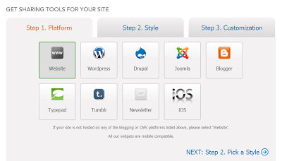
1. Buka ShareThis.com.
2. Daftar terlebih dahulu/Login jika sudah mempunyai akunnya.
3. Pilih menu Get Sharing Tools.
4. Pada step1 (Platform) klik website kemudian pilih NEXT Step2.
5. Pada step2 lihat kolom ke 2 baris ke 2 pada bagian Bars, kemudian di klik lalu NEXT Step3.
6. Pada step ke 3 ini isi sesuai data website kalian (Lihat video jika kurang jelas).
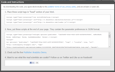
7. Klik Finish: Get The Code

Ini video tutorialnya biar lebih mudah membuatnya, silahkan disimak :)


Bagaimana menurut sobat tentang tutorial Membuat share button menggunakan sharethis.com? Mudah kan? Oke sampai disini dulu ya sobat. Semoga artikel ini bermanfaat buat kalian semua :D bye bye bye!!~

Cara Mudah Mengganti Scroll Bar Keren Pada Blog

Next: Membuat Tombol Back to Top Dengan Mudah Pada Blog
Previous: Membuat share button menggunakan sharethis.com [Video]
$
0
0
Cara Mudah Mengganti Scroll Bar Keren Pada Blog - Selamat siang sobat, kali ini saya mau memberiahukan Cara Mudah Mengganti Scroll Bar Keren Pada Blogspot. Simple sekali caranya, mungkin 1 menit sudah jadi haha :p
Cara Mudah Mengganti Scroll Bar Keren Pada Blog
Contoh Scroll Bar keren
Kurang lebih kita akan membuat scroll bar seperti gambar diatas. Ikuti langkah berikut ini sobat.
1. Buka/Login Blogger.com
2. Masuk ke menu Template > Edit HTML.
3. Cari kode ]]></b:skin>, gunakan CTRL+F untuk permudah pencarian.
4. Salin dan Taruh kode dibawah ini tepat diatas ]]></b:skin>.

Warna dari Scroll Bar diatas bisa diubah sesuai keinginan sobat. Misal warna #00A000 (hijau) diganti dengan warna #222020 (hitam) dan lain sebagainya.
Untuk permudah pencarian warna gunakan Color Code Generator ini.

Oke selesai sudah Cara Mudah Mengganti Scroll Bar Keren Pada Blog anda. Mudah bukan? silahkan dicoba dan semoga bermanfaat. Oh iya Scroll Bar ini rekomen di Google Chrome~ :)

Membuat Tombol Back to Top Dengan Mudah Pada Blog

Next: Mendapatkan Backlink Mudah dan Berkualitas di W3 Directory
Previous: Cara Mudah Mengganti Scroll Bar Keren Pada Blog
$
0
0


Membuat Tombol Back to Top Dengan Mudah Pada Blog - Sebenarnya saya sudah memberikan tutorial yang sama seperti ini, tapi dengan menggunakan bahasa Inggris dan cukup sulit untuk membuatnya "How To Add Go To Top And Go To Bottom Buttons In Blogger". Sekarang saya akan memberikan cara yang mudah dimengerti dan memakai Bahasa Indonesia dan caranya cukup simpel.
Membuat Tombol Back to Top Dengan Mudah Pada Blog
Contoh Scroll to Top
Kita akan membuat seperti yang diberi tanda panah pada gambar diatas. Baiklah sobat ikuti langkah ini ya.
1. Buka/Login Blogger.com.
2. Pilih menu Tata Letak/Layout.
3. Pilih Tambahkan Widget/Add Widget > HTML/Javasript.
4. Salin dan Taruh script dibawah ini.

5. Ganti URL GAMBAR dengan URL Gambar yang telah dipilih oleh sobat gunakan CTRL+F cari <img src="URL GAMBAR" /> untuk permudah pencarian.
6. Simpan/Save.
7. Gulung/Sorot layar pada blog sobat. Taraaaa~

Sekian tutorial Membuat Tombol Back to Top Dengan Mudah Pada Blog, Semoga bermanfaat ya~

Berikut URL Gambar yang bisa sobat pakai :)

Mendapatkan Backlink Mudah dan Berkualitas di W3 Directory

Next: Memperbaiki Pesan Komentar atau Emoticon Yang Turun Kebawah
Previous: Membuat Tombol Back to Top Dengan Mudah Pada Blog
$
0
0
Mendapatkan Backlink Mudah dan Berkualitas di W3 Directory - Mengapa kita harus mendapatkan Backlink yang banyak? Apa Backlink itu? Backlink bisa di artikan sebuah script link yang disusun berisi alamat suatu web/blog, yang dipasangkan ke dalam suatu situs/blog tertentu. Kenapa kita harus membangun sebuah backlink? Karena backlink sendiri memiliki manfaat untuk menaikkan PageRank blog kita di dalam suatu mesin pencari seperti Google, Yahoo, Ask dll.


Mendapatkan Backlink Mudah dan Berkualitas di W3 Directory


W3 Directory adalah salah satu web directory yang memberikan backlink gratis dan ampuh bagi para penggunanya. Cukup dengan submit beberapa artikel anda saja tanpa perlu submit semuanya, sobat akan mendapat backlink secara Gratis dan terus bertambah tiap bulan. backlink dari w3 directory ternyata terindek oleh Google dan mesin/tools pengecek backlink lainnya.
Cara Mendapat Backlink Gratis Berkualitas hanya tinggal ikuti langka berikut ini :

1. Buka link W3 Directory.
2. Pilih menu Add a Website.
3. Isi Form pada Add a Website tersebut.
    *URL : Alamat blog / link blog.
    *Title : Nama blog.
    *Description : Deskripsi blog sobat.
    *Keywords : Kata kunci yang menggambarkan blog sobat.
    *Identity : Isi dengan nama sobat.
    *Email : Email sobat (valid).
    *Return Link / Back Link : Link untuk mendapatkan backlink dari w3 directory, Isi sesuai URL.
    *Country : Indonesia.
    *Heading 1 : Kategori utama untuk blog sobat.
    *Heading 2 : Kategori ke dua blog sobat.
    *Heading 3 : Kategori ke tiga blog sobat.
      Kemudian klik  Submit my web site.

Catatan: setiap ada tanda bintang (*) artinya wajib diisi. 

Karena backlink ini adalah salah satu backlink gratis yang berkualitas terbaik maka tentu tidak serta merta kita langsung mendapatkan backlink. Backlink dari w3 directory bersifat 2 arah. Maksudnya adalah kita akan mendapatkan backlink jika ada yang melakukan vote terhadap kita di w3 directory tersebut. Jadi sobat harus kreatif mencari cara agar banyak vote untuk memdapatkan banyak backlink gratis yang berkualitas. Salah satu cara dapat backlink gratis berkualitas ini dengan share link di facebook atau di forum forum yang sobat ikuti.

Demikianlah Bagimana Mendapatkan Backlink Mudah dan Berkualitas di W3 Directory. Semoga bermanfaat~

Memperbaiki Pesan Komentar atau Emoticon Yang Turun Kebawah

Next: New on NFS :: Need For Speed RIVALS!
Previous: Mendapatkan Backlink Mudah dan Berkualitas di W3 Directory
$
0
0
Memperbaiki Pesan Komentar atau Emoticon Yang Turun Kebawah - Selamat malam sobat, saya baru tau jika ingin mereply komentar pasti emoticon saya tidak mau mengikuti kotak reply komentarnya. Nah saya punya solusinya dan habis cari-cari di internet.
Memperbaiki Pesan Komentar atau Emoticon Yang Turun Kebawah
Contoh Emoticon yang sudah diperbaiki
Okay langsung saja ya, ikuti langkah dibawah ini sobat.
1. Buka/Login Blogger.com.
2. Back up template anda untuk berjaga-jaga terjadinya error.
3. Pilih menu Template > Edit HTML.
4. Cari kode <b:includable id='threaded-comment-form' var='post'>, gunakan CTRL+F untuk permudah pencarian.
5. Ganti kode dibawah ini.

    Dengan kode dibawah ini.

6. Cari kode document.getElementById(domId).insertBefore(replybox, null);
7. Ganti dengan kode dibawah ini.

8. Simpan/Save Template.

Okay selesai. Silahkan dicoba! :) Semoga bermanfaat~

New on NFS :: Need For Speed RIVALS!

Next: Menaikkan Alexa Pagerank dengan Mudah dan Cepat
Previous: Memperbaiki Pesan Komentar atau Emoticon Yang Turun Kebawah
$
0
0
Risk Everything in the Ultimate Rivalry
Welcome to Redview County, a gritty open road environment where the intensity of the street's ultimate rivalry between cops and racers never stops.
New on NFS :: Need For Speed RIVALS!

High Stakes Rivalry.
Defeat your rivals by any means necessary
Racers are lone wolves out for their own glory; driving agile cars built for high speed racing and epic chases. Cops work in teams to hunt down and bust racers using the full power of the police force.
Switch roles at any time and watch the stakes grow in an all-new scoring system that lets you put your speed points on the line to earn even greater rewards.

All Drive.
Destroying the line between singleplayer and multiplayer
New in Need for Speed Rivals, All-Drive destroys the line between singleplayer and multiplayer gameplay. Seamlessly join a world where your friends are already racing and chasing. No lobbies. No waiting.
Paths cross and experiences merge, creating a world where your race and your friend's pursuit collide.

Next-Gen Racing.
Destroying the line between singleplayer and multiplayer
New in Need for Speed Rivals, All-Drive destroys the line between singleplayer and multiplayer gameplay. Seamlessly join a world where your friends are already racing and chasing. No lobbies. No waiting.
Paths cross and experiences merge, creating a world where your race and your friend's pursuit collide.

Your Car, Your Identity.
Personalize your cars with performance and style
Power up your car with the latest upgrades in pursuit technology and personalize your bodywork with fresh paintjobs, liveries, custom license plates, rims, and decals to show off your car to the world.
Save different configurations and keep a variety of car packages on alert to leave your mark no matter the situation.

Pursuit & Evasion Tech.
Use the latest technology and upgrades customized to each side of the law
Intense racing moments are made even more thrilling with access to technology and upgrades customized to each side of the law.
Racers can choose evasion technology from jammers to electromagnetic pulses. Cops are outfitted for aggressive busts with shockwaves, roadblocks, helicopter support and more. No matter the side you choose, use technology to stay one step ahead of your rivals.

PRE-ORDER RIVALS TODAYGET THE ULTIMATE COP PACK

  • Exclusive access to the
    Nissan GT-R Black Edition
  • Early access to advanced pursuit technology

Remove ADS
Viewing all 412 articles
Browse latest View live